
U

U JIU-JITSU
2024
U is a Fight-wear lifestyle brand made for Jiu-Jitsu athletes, hobbyists and competitors. It was conceptualised to connect emotionally with its audience, communicating in a single monogram the essence of jiu-jitsu: to stay practicing and improving it. My participation on this project was to design the brand as well as the e-Commerce website.
The Brand
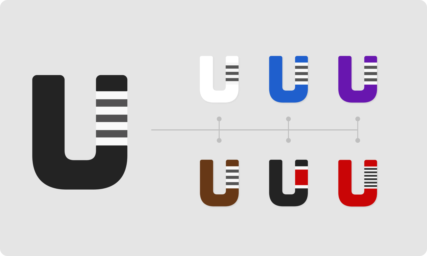
U is a brand that speaks all these individual challenges to overcome, as a belt with all the stripes: the next goal for whichever belt you are.
Detailed with the infamous stripe system, it is easily recognised from afar by those who embrace the Gentle Art.
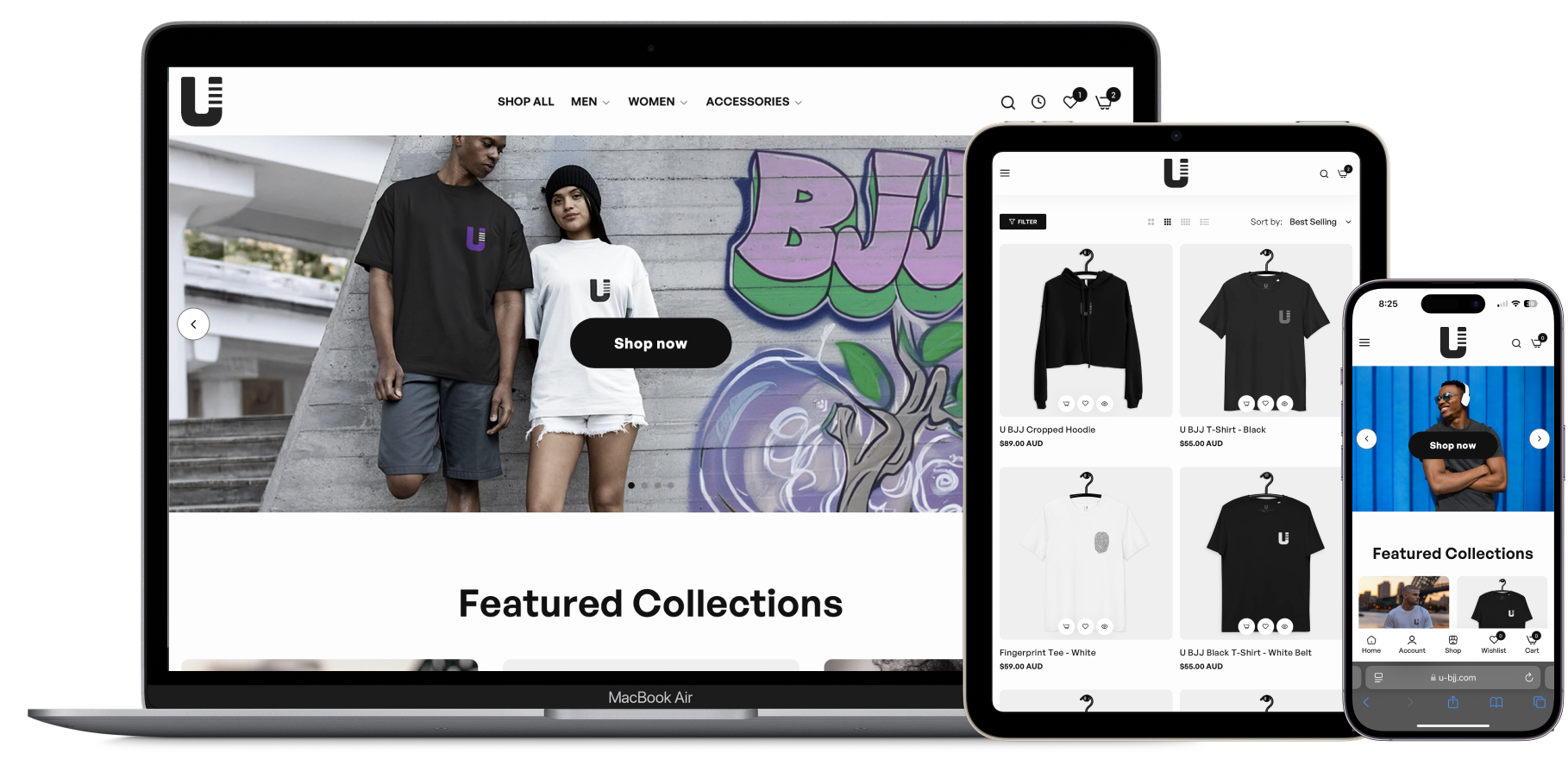
Minimalistic design
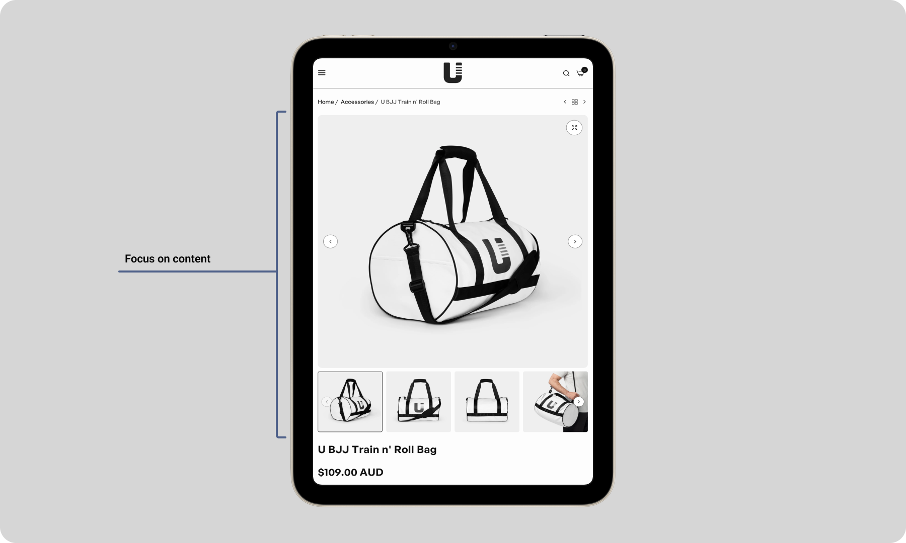
The site utilizes a clean, high-contrast visual hierarchy with ample whitespace. The design is strictly utilitarian—black text on a white background—which ensures that the high-quality product photography is the undisputed focal point.
By avoiding decorative clutter, the user’s cognitive load is reduced. They can scan the "Featured Collections" and product grids instantly without being distracted by unnecessary banners or complex graphics, allowing for a focused shopping experience.
Frictionless Standards
Users should not have to wonder whether different words, situations, or actions mean the same thing. This site leans heavily into established e-commerce conventions.
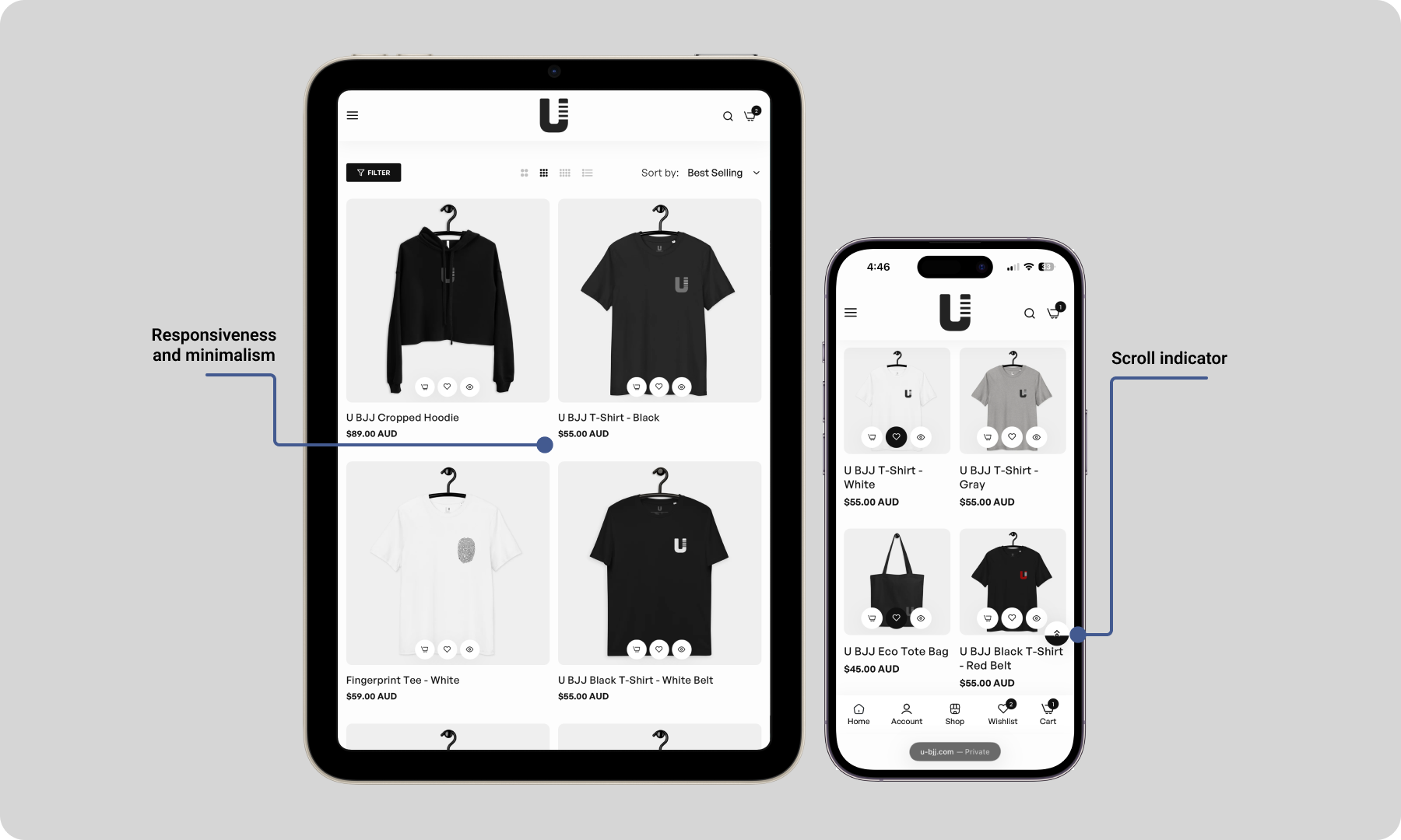
The navigation and layout follow a universally understood e-commerce mental model. The shopping cart is in the top right, the primary navigation (Shop All, Men, Women) is clearly prioritized in the header, and the product grid behaves exactly as a user expects.
Quicker browsing, faster checkout
UX Accelerators, can often speed up the interaction for the expert user so that the system can cater to both inexperienced and experienced users. In this case, the inclusion of "Quick View" and "Add to Cart" buttons directly on the product listing pages.
For a returning user who knows their size or just wants to grab a specific rashguard, they are not forced to click into the product detail page, wait for it to load, and then add the item. They can perform the transaction directly from the collection view. This serves as an "accelerator," significantly speeding up the shopping process for decided buyers.
U


Work
U
Cognixus
Thriive
Bet Technology
WBS
Oni
Dell
Let's chat

Work
U JIU-JITSU
2024
U is a Fight-wear lifestyle brand made for Jiu-Jitsu athletes, hobbyists and competitors. It was conceptualised to connect emotionally with its audience, communicating in a single monogram the essence of jiu-jitsu: to stay practicing and improving it. My participation on this project was to design the brand as well as the e-Commerce website.
The Brand
U is a brand that speaks all these individual challenges to overcome, as a belt with all the stripes: the next goal for whichever belt you are.
Detailed with the infamous stripe system, it is easily recognised from afar by those who embrace the Gentle Art.
Minimalistic design
The site utilizes a clean, high-contrast visual hierarchy with ample whitespace. The design is strictly utilitarian—black text on a white background—which ensures that the high-quality product photography is the undisputed focal point.
By avoiding decorative clutter, the user’s cognitive load is reduced. They can scan the "Featured Collections" and product grids instantly without being distracted by unnecessary banners or complex graphics, allowing for a focused shopping experience.
Frictionless Standards
Users should not have to wonder whether different words, situations, or actions mean the same thing. This site leans heavily into established e-commerce conventions.
The navigation and layout follow a universally understood e-commerce mental model. The shopping cart is in the top right, the primary navigation (Shop All, Men, Women) is clearly prioritized in the header, and the product grid behaves exactly as a user expects.
Quicker browsing, faster checkout
UX Accelerators, can often speed up the interaction for the expert user so that the system can cater to both inexperienced and experienced users. In this case, the inclusion of "Quick View" and "Add to Cart" buttons directly on the product listing pages.
For a returning user who knows their size or just wants to grab a specific rashguard, they are not forced to click into the product detail page, wait for it to load, and then add the item. They can perform the transaction directly from the collection view. This serves as an "accelerator," significantly speeding up the shopping process for decided buyers.
Work
U JIU-JITSU
2024
U is a Fight-wear lifestyle brand made for Jiu-Jitsu athletes, hobbyists and competitors. It was conceptualised to connect emotionally with its audience, communicating in a single monogram the essence of jiu-jitsu: to stay practicing and improving it. My participation on this project was to design the brand as well as the e-Commerce website.
The Brand
U is a brand that speaks all these individual challenges to overcome, as a belt with all the stripes: the next goal for whichever belt you are.
Detailed with the infamous stripe system, it is easily recognised from afar by those who embrace the Gentle Art.
Minimalistic design
The site utilizes a clean, high-contrast visual hierarchy with ample whitespace. The design is strictly utilitarian—black text on a white background—which ensures that the high-quality product photography is the undisputed focal point.
By avoiding decorative clutter, the user’s cognitive load is reduced. They can scan the "Featured Collections" and product grids instantly without being distracted by unnecessary banners or complex graphics, allowing for a focused shopping experience.
Frictionless Standards
Users should not have to wonder whether different words, situations, or actions mean the same thing. This site leans heavily into established e-commerce conventions.
The navigation and layout follow a universally understood e-commerce mental model. The shopping cart is in the top right, the primary navigation (Shop All, Men, Women) is clearly prioritized in the header, and the product grid behaves exactly as a user expects.
Because the site adheres to these standards (Jacob's Law), users do not need to learn how to use this specific interface. They can transfer their knowledge from Amazon or other major retailers directly to this store, reducing the friction between landing on the page and making a purchase.
Quicker browsing, faster checkout
UX Accelerators, can often speed up the interaction for the expert user so that the system can cater to both inexperienced and experienced users. In this case, the inclusion of "Quick View" and "Add to Cart" buttons directly on the product listing pages.
For a returning user who knows their size or just wants to grab a specific rashguard, they are not forced to click into the product detail page, wait for it to load, and then add the item. They can perform the transaction directly from the collection view. This serves as an "accelerator," significantly speeding up the shopping process for decided buyers.


